
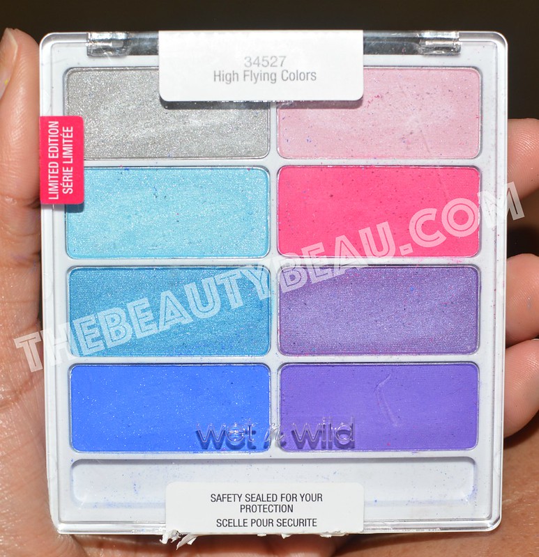
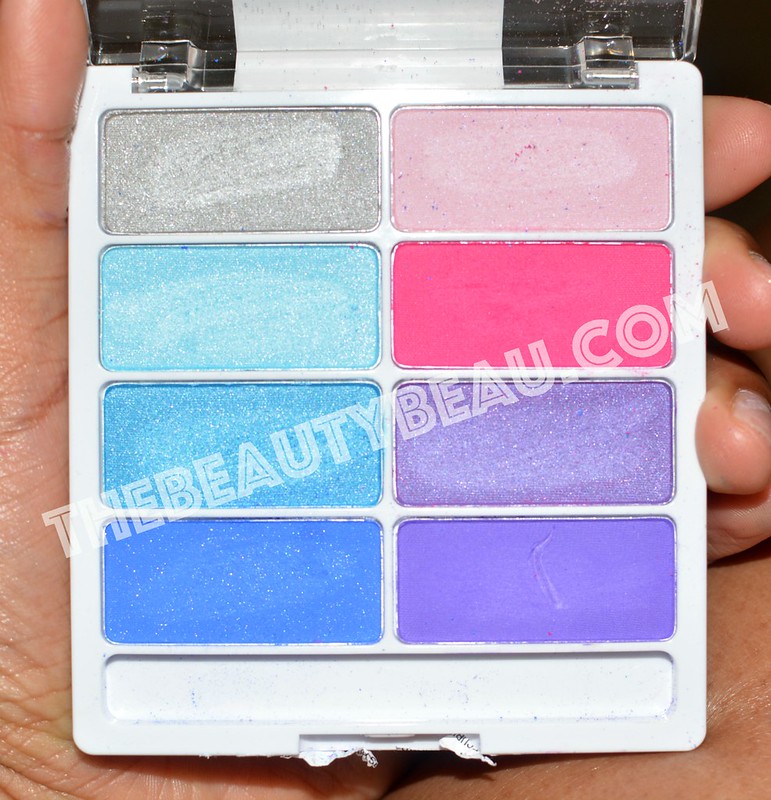
I know some of you have been anxiously waiting for this post since my last on the Wet ‘n Wild Boardwalk Boozing palette lol. Well trust me, it only gets better and better from then. Today, I have the Wet ‘n Wild High Flying Colors Color Icon palette to show you. It boasts beautiful purples, blues, pinks, with a lonely silver. Though it’s lonely, it does not lack luster by any means. Check them out!
Obviously, I filmed a tutorial using this look, which I am very excited to show you. Had to throw that out there 🙂
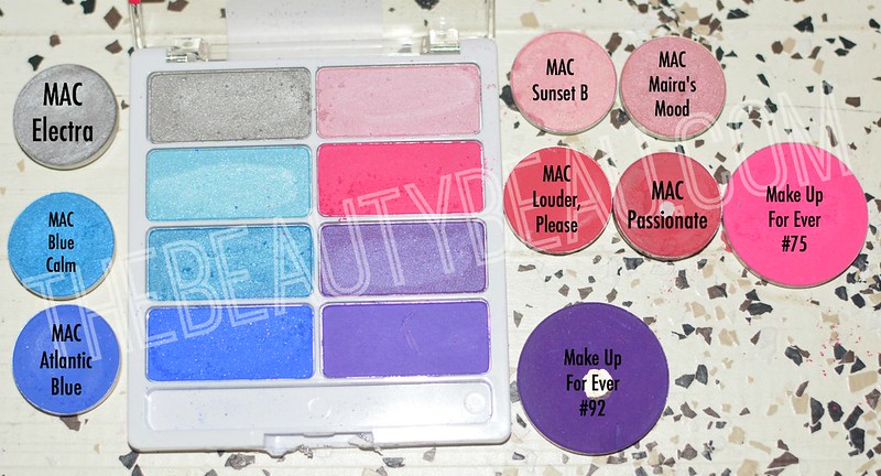
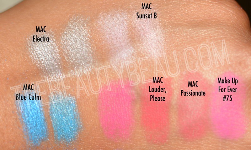
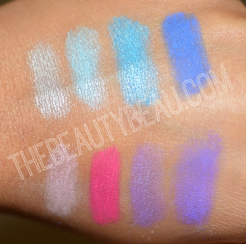
In the video, I thought the silver was a MAC Electra Eye Shadow dupe, but I was clearly wrong. The MAC version is much more metallic, but the Wet ‘n Wild version is able to be worn wet, which may very well make it more similar for you. It’s still a gorgeous silver nonetheless!
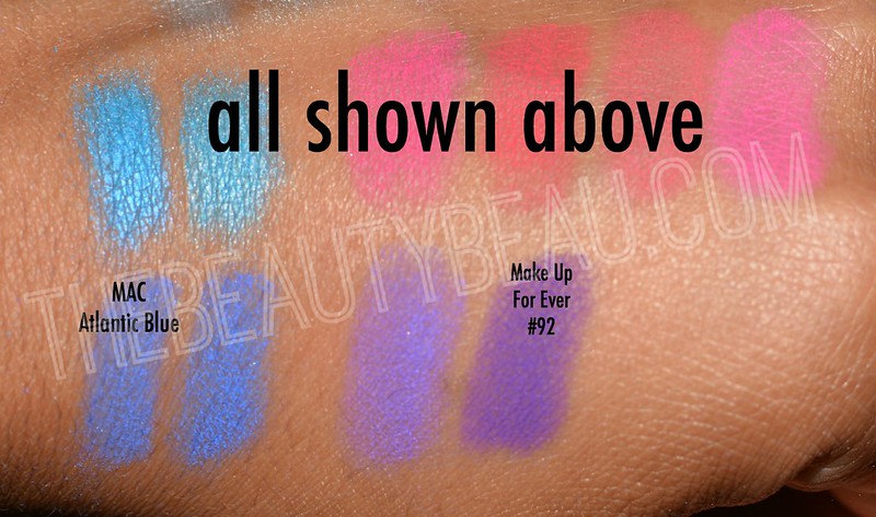
Once again, the sky blue in the palette was not what it appeared to be. I initially thought MAC Sky Blue Eye Shadow was similar, but upon swatching, I was wrong again. Just remember, objects are not always what they appear (reminds me of that message in my car mirrors that read “objects in the mirror may be closer than they appear“). *shrugs* Moving on…
So the teal/turquoise shade in the palette is unique on its own. The color I had, MAC Blue Calm Eye Shadow, is not even close. The MAC version leans more turquoise while the Wet ‘n Wild version leans more teal.
MAC Atlantic Blue Shadow should have been this color, but it wasn’t. I noticed that the Wet ‘n Wild version does not darken as you blend, but it maintains its shade, the one reflected in the palette. Obviously, this along with others in the palette will be much more effective when worn over an eye shadow base/primer. The are pretty much dupes, but remember what I said about the Wet ‘n Wild color remaining a true royal blue.
So the light pink doesn’t appear to be much, but it is gorgeous in my eyes. I added it to the tear duct area of my eyes for a subtle glow, but i can just imagine what it will look like over a darker base. It is very similar to MAC Sunset B Eye Shadow.
Yeah so the pink is not only more gorgeous than its MAC predecessors, but it is also more pigmented. Who doesn’t like that? I also watched Make Up For Ever #75 on the far right. It is very similar to the Wet ‘n Wild pinks though it doesn’t appear to just by looking at the two. Looks can definitely be deceiving! Save your money by not getting the MUFE option.
The purple initially reminded me of MAC Satellite Dreams Eye Shadow, but I swatched it and was wrong for the third time. I also forgot to take a picture. Imagine that.
This is probably what you’ve all been waiting for…how does the purple compare to Make Up For Ever #92? Ever heard that a darker base underneath an eye shadow can make it darker? Well, I’ll let you make that decision on that one. (P.S. The Wet ‘n Wild palette is cheaper.)
Gorgeous colors in the palette once again. I’m obsessed with brights, as I have been since 2008 and this palette did not disappoint. I am over the moon!
Come back in a day or two for a tutorial using this palette. There is no accompanying video review of this palette, so my blog readers have the upper hand this time because you aren’t missing this! You can check out my Boardwalk Boozing review here and the tutorial here if you missed it!
I also do have the other palette up for review in the very, very near future 🙂
[…] the 3 palettes, 2 of which I have already reviewed. If you would like to check out my review on the Wet ‘n Wild High Flying Colors Color Icon Palette and the Wet ‘n Wild Boardwalk Boozing Color Icon Palette, click the hyperlinks shown in this […]